
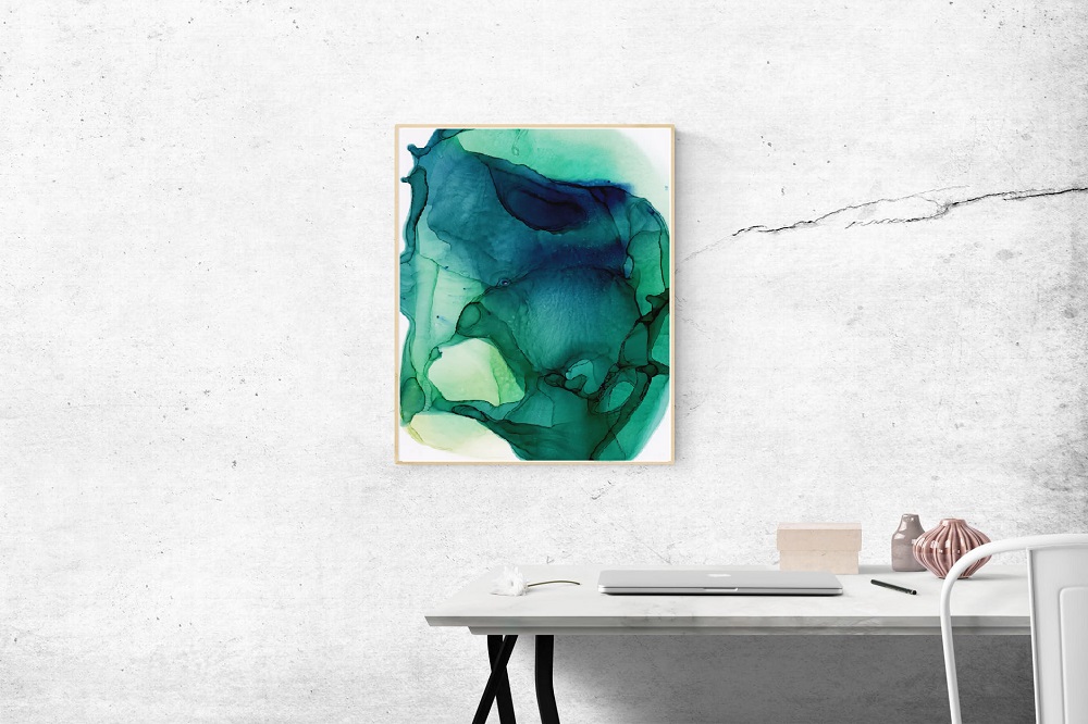
Color: Choosing Warm Tones Or Cool Tones For Your Home
Color: Choosing Warm Tones or Cool Tones for Your Home Do you like the warm comfort of earth tones and […]
Color: Choosing Warm Tones Or Cool Tones For Your Home Read More »
Artsy Metropolitan Living In A Satire
Color: Choosing Warm Tones or Cool Tones for Your Home Do you like the warm comfort of earth tones and […]
Color: Choosing Warm Tones Or Cool Tones For Your Home Read More »

Negative space is the standard when you want people to focus on the art in front of them. It is
Why Art Needs Negative Space Read More »

The orange of the berries of the Rowan Tree (Mountain Ash) look striking against the blue sky. Complementary Colors: Blue
Complementary Colors: Blue and Orange Read More »
I sit, staring in trepidation at the canvas. The piece has quite a bit of negative space. Any mark is
Making A Mark: Analysis Paralysis In Painting Read More »
The painful reality of shipping fine art. You’ve been there. We all have. You found something you love in an
Why Are Art Shipping Prices So High? Read More »
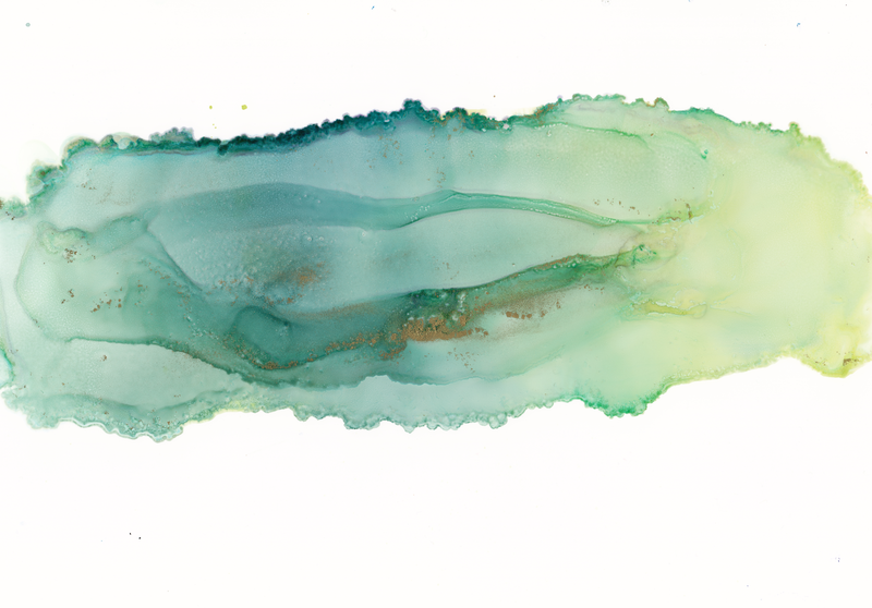
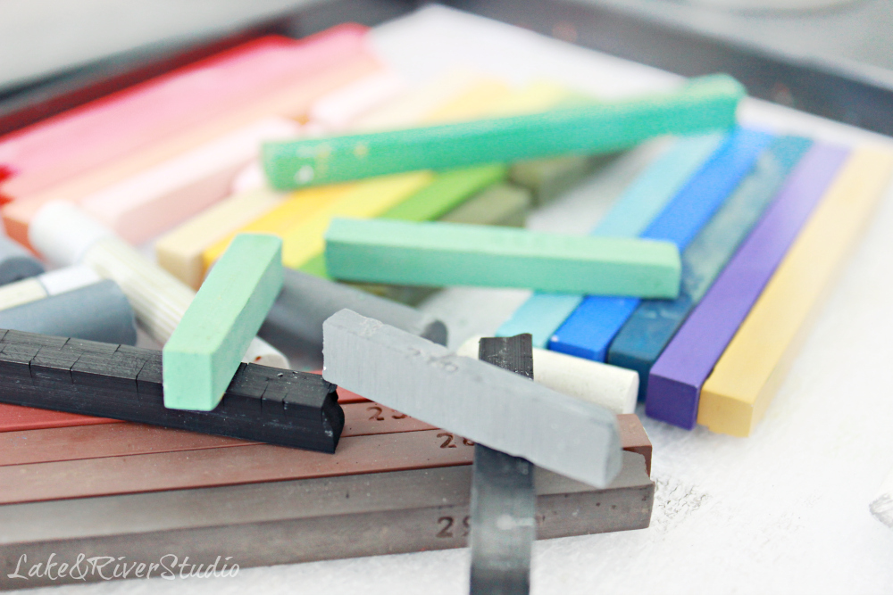
A look at the color green. Go green. It’s not easy being green. Show me the green. Green. Green. Green!
For the Love of Green in Art and Design Read More »