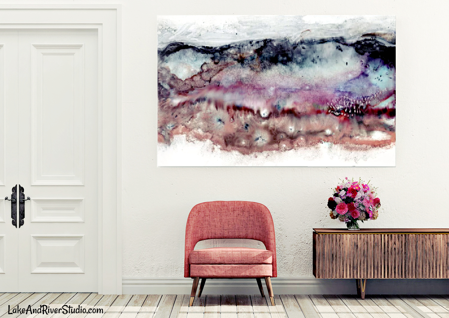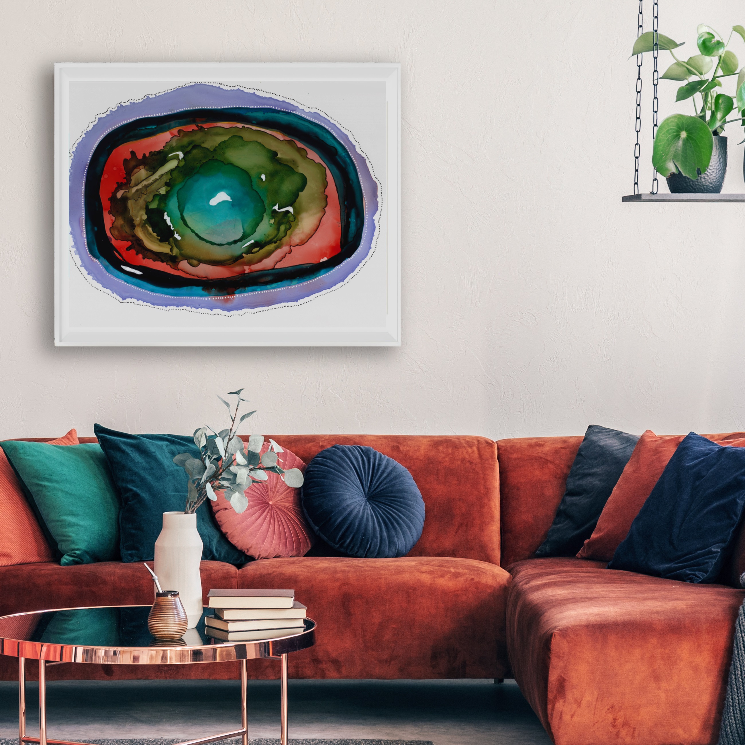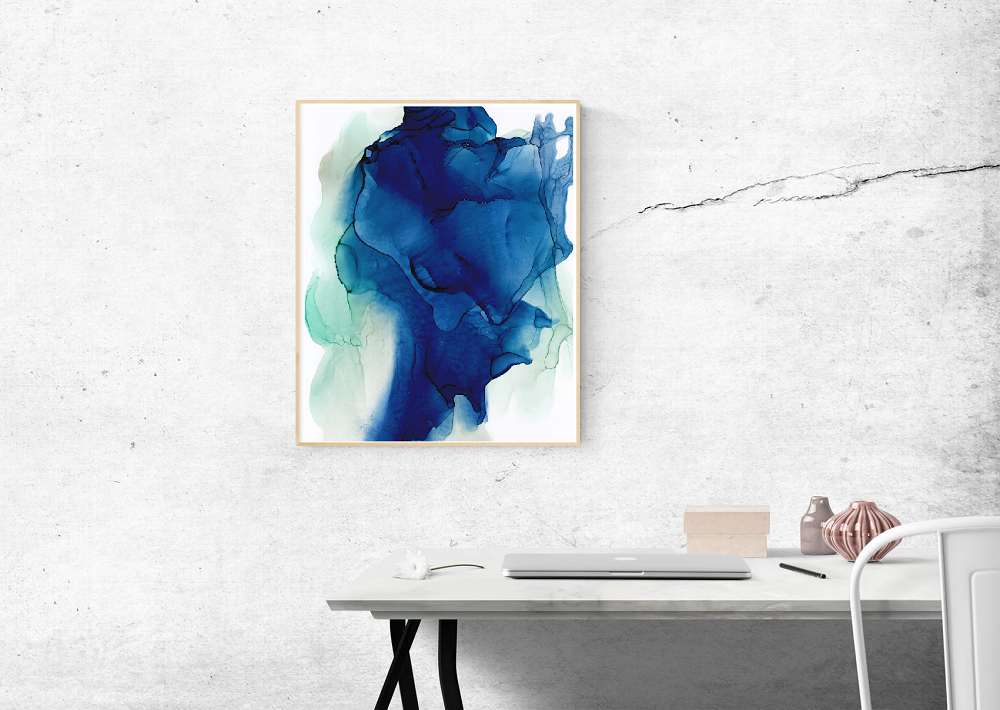
Collecting art can be intimidating. It can also be fun. Some collectors will be strategic and only ever acquire a particular type of art creating a very cohesive collection. Others might just collect anything that catches their eye, thereby creating a collection that spirals out in several directions and seems more eclectic. Neither way is wrong or right.
However, when it comes to interior design, it is easier to display a simple and cohesive collection. The collection where everything ties together nicely can simply flow from one room to the next without much drama. Meanwhile, the more hodgepodge collection has the risk of making your home look like a museum store room or like your eccentric aunt Gertrude’s slightly hoarder-ish library with its overwhelming dedication to every style ever known to mankind.
Luckily, you can still make your more eclectic collection tie together into a consistent and impressive display.

How to Create Consistency in Your Art Collection
Framing
No matter how diverse a grouping of wall art, you can pull it all together with consistent framing. Ornate frames with a specific patina will draw as much attention to the frame as it does the artwork. You can also try displaying a collection with complementary colors in the framing or a color scheme to make the collection feel more consistent.
Style
Your art collection can come across as organized and consistent if they are in similar styles. For example, you could have landscapes, portraits, stills, and even abstracts all together and create consistency through them all being somewhat impressionistic or containing similar brush work.
Color scheme
As mentioned when discussing framing, creating a color scheme or color story can make a consistent presentation. Maybe you really love everything green. In that case, you could mix all types of paintings, drawings, prints, pastels, and styles all together and have shades of green be your unifying element. Or coordinate your whole collection in green frames. Or maybe you have an assortment, but it is all black and white. Working in a limited color scheme can be challenging, but the challenge can be fun and encourage creativity in your display.
Positioning
By positioning, I mean experimenting with display like locations or creating gallery walls. Sometimes you can create better flow through a room by rearranging the wall art. Sometimes a diverse collection just needs to be reordered and suddenly it makes visual sense. This is where it is beneficial to use painters tape to map out your gallery wall. Or you can always photograph your wall and insert the art in an editing software to try out different arrangements. Sometimes you think you have it, only to redo it in six months. It happens. But at least reordering the gallery wall is free minus repairing your nail holes.
Medium
Sometimes the collection just needs to be grouped by medium to look consistent and balanced in your decor. A series of line drawings intermixed with other graphite sketches can go together since they are likely all done in pen or pencil. Or you can group all the oil paintings together. Small sculptures can be together in a vignette. Perhaps prints with prints and canvases with canvases. (Although, I like to mix things up a bit to create texture.) The point being a collection of lithographs or super textured palette knife paintings already have a theme even if the subject matter and colors differ.

All in all, there are several ways to bring it all together and make your artwork flow in your decor. It can take some trial and error, but the end results can elevate your interior design to a new level of sophistication without even technically redecorating. You just rearranged! Also remember that sometimes perfect consistency can be overrated. Whatever works in your home best is really whatever makes you happy.


