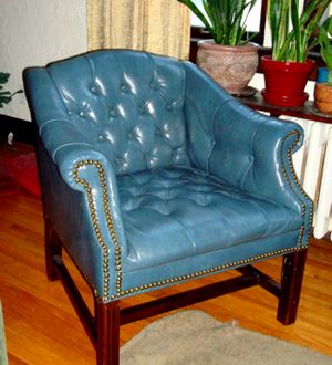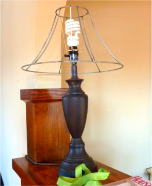
I thought of including photos of ridiculous staging stations and vignettes, but I really have not accommodated our staging consultant enough to have anything worthy of documenting.
See, I hate staging. I get it. It is important. You want people to get a good impression of your house and convince them it is a good buy. I understand having it as clean and uncluttered as possible. I am completely in support of portraying a fresh canvas. What I am stumped over is ridiculous staging. Things that scream “No One Lives Like This”. Like the suggestion I create a coffee station in our home office on the second floor. I can kind of understand. Our office is set up in a way that it could be converted into a second kitchen. In fact our whole house is set up to be able to convert into an odd duplex if one were so inclined. (Although it was not built to be one.) However, that second floor coffee station is one of several suggestions that would make this house seem more of an office complex than an old Victorian house. I have moved around furniture and storage to go along with the staging list, but I draw the line at hanging artwork on the walls. (Plaster walls make hanging stuff more complicated.) I also draw the line at all of the suggestions that would require me to spend at least $800 at Target on stuff I don’t like for a house I don’t want.
Empty out your glass cabinets and fill them with decorative candles!
Remove the books from your wood bookshelves and replace them with flowers and candles!
Remove all traces that your children exist and replace them with…….flowers and candles!
Coffee stations for every floor.
Wicker chairs next to a wood burning fireplace.
I didn’t bother to explain that having wicker in our main living area was:
A) Weird considering we are in the far north where people reserve any and all wicker for a porch,
And
B) Wicker next to a sparking fire is a bad idea in general.
Not to mention, my kids would pick it apart like rabid ferrets.
Also, I am supposed to remove my work equipment from my office and replace it with flowers, baskets, and you guessed it, candles. No work to be done in here, people. My job is to run a nonprofit Kirkland’s out my home apparently.
I am not complaining mind you. This has all been an amusing laugh between my husband and me. I have done what I could from the suggestion list, and thoroughly ignored the ridiculous.
I won’t be hiding my daughter’s high chair in the basement every day. I won’t be spending a bunch of money on silly decorations. I won’t be spending hours trying to find a single stud behind all the plaster and metal lathe to hang a print. I’m not buying a chair to match the loveseat I already put out on the curb.
I decided a blank slate approach was more important. This house is pretty awesome compared to everything else in the neighborhood. It will sell itself. Especially when I see other staging photos full of doilies and tangerine walls. Our ‘greige’ walls, bare wood floors, and lack of stuff is a good thing if you ask me.
But, it at least explains the hilarity we encounter when looking at homes to buy. There are times when a house is so obviously staged, in such a ridiculous way, that it actually distracts me from really looking at the house. And that is where these realtors and stagers go wrong. It is one thing to try to keep the attention off the fact that a house it not great. It is another thing to try and turn a single family home into a hotel or conference complex. Taking my attention away from the real function of the room by drawing my focus to a silly vignette will keep me from buying the house. Because I didn’t even get to the part where I try to visualize our family living there.
So if you are staging your house to sell, take any suggestions with a grain of salt. Clearing off horizontal spaces makes sense. Replacing your proof of life with nonsense is just that, nonsense.


